Energy Hub: concept to launch
Formerly EMCP: a transformational digital energy management product for Schneider Electric, a global producer of energy management hardware and software. Mø was Principal UX Designer end to end, from pre-research through launch, evolving a legacy flagship product that customers had grown dissatisfied with.
Note: the product underwent several name revisions while in production which will explain why many iterations use different names.
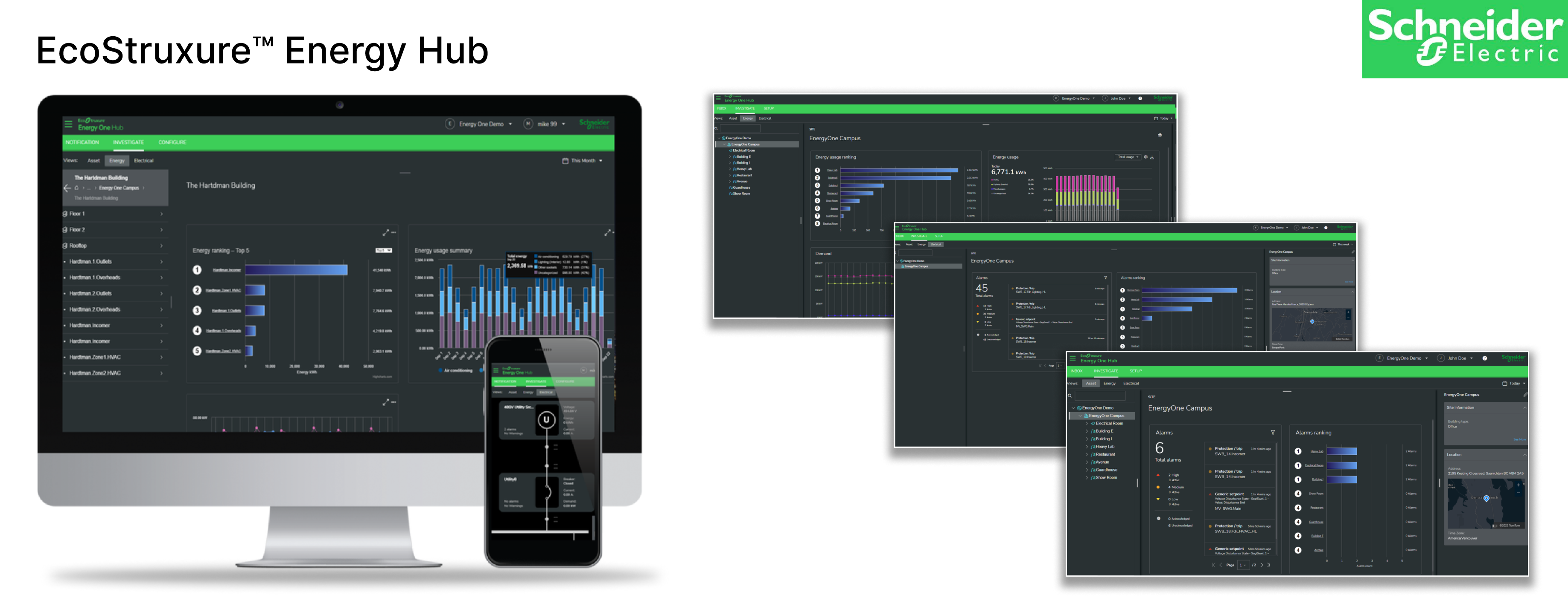
A costly tool customers no longer valued
Customers had grown increasingly dissatisfied with the expense of a huge tool that, in many cases, offered far more capability than most of them used, and it showed in a poor perception of value. The product had also grown for years the way industrial software usually does: engineers shipping what the system could expose, not what an operator actually needed in the moment, with no design team, shared components, or research practice behind it.
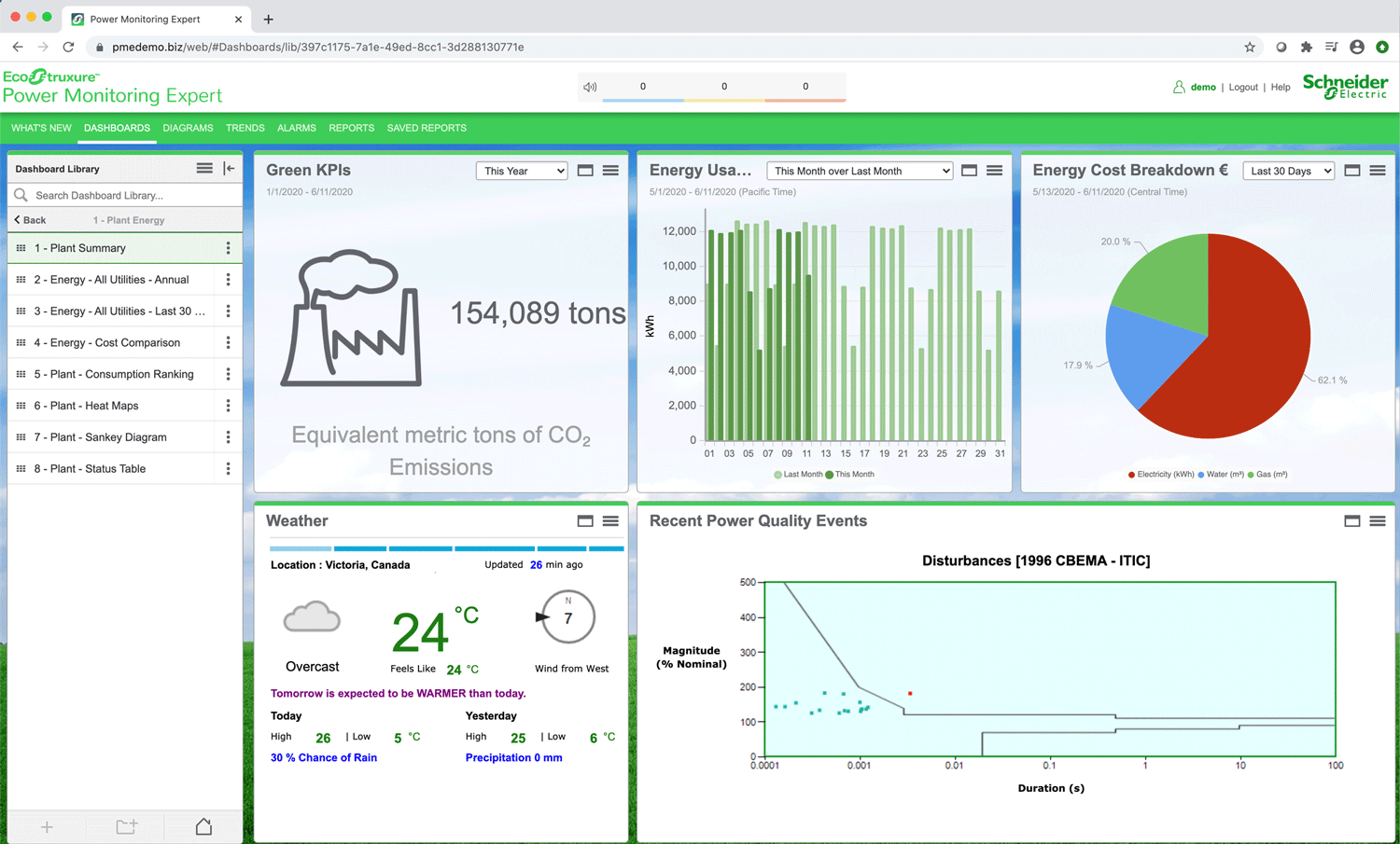
A modular platform, and the practice to build it
Partnering with the business development team, Mø strategized a modular architecture that let customers build a customized solution from a catalog of capabilities tied to a SaaS model, and moved the offer to a secure cloud platform. He led the advancement of the UI to a modern aesthetic with contemporary interactions and hired and led a team of 12 designers to apply it across the modules operators touch daily. His research and mockups also fed the evolution of the Schneider Electric Design System, winning a company award along the way.
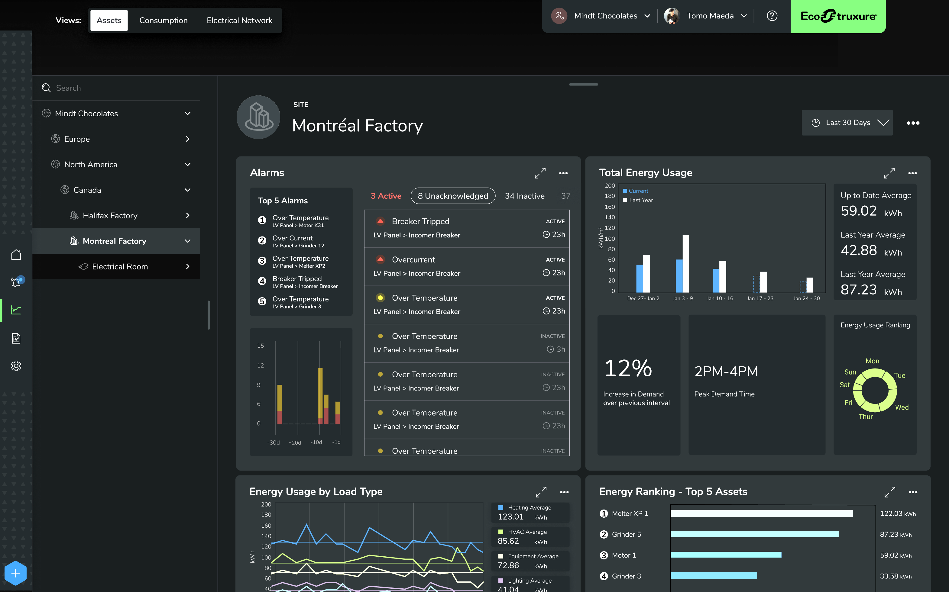
Building the production line while the plane was in flight
Schneider Electric had never had a formal UX research practice, a contemporary development process, or a way to keep 12 designers and a skeptical stakeholder group aligned over a two-year roadmap. Mø built all three at once.
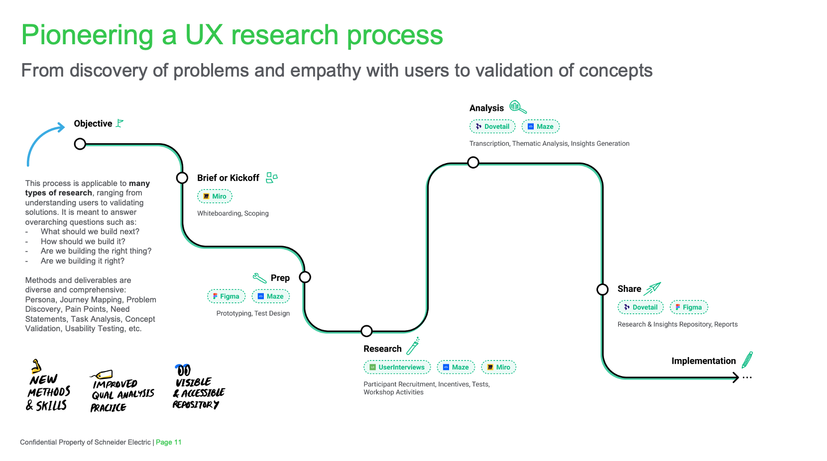
A research practice, from nothing
There was no formal UX research function. Mø created one while conducting the research itself, including an organization-wide research repository other teams still use.
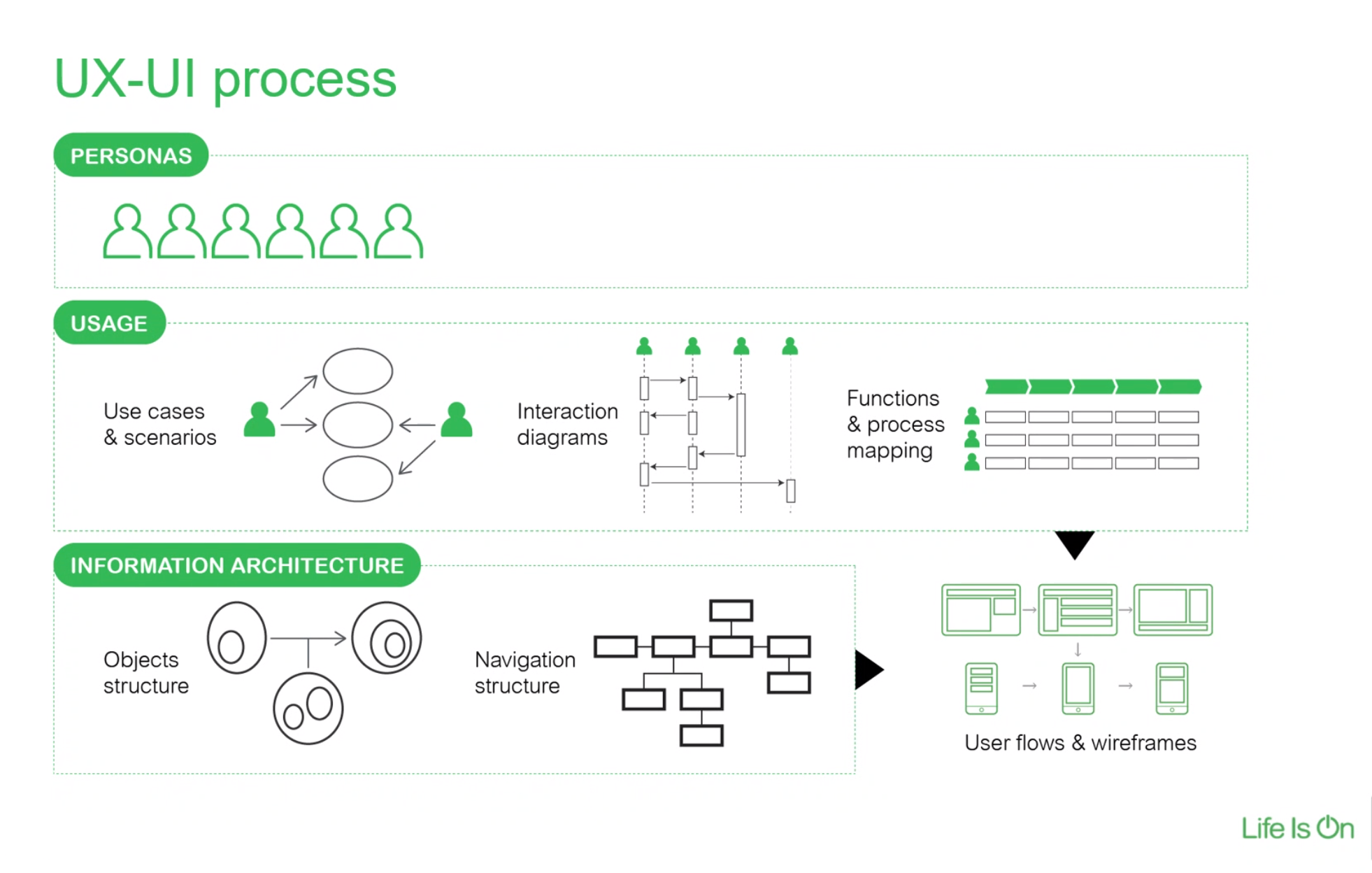
Establishing a UX process
Mø evangelized a contemporary UX design process, mapped the Design Thinking model to a best-practice process, specific tools and deliverables winning leadership approval to move the org from Adobe Sketch to Figma. He then used this momentum to stand up a rudimentary DesignOps.
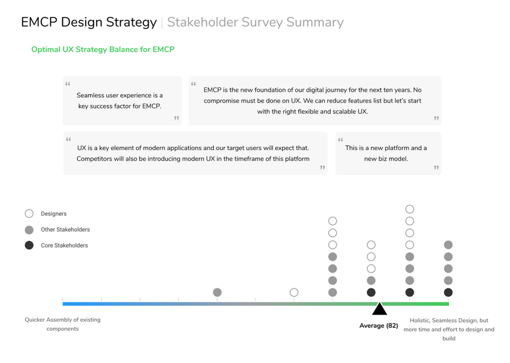
Stakeholder alignment, in writing
A survey had stakeholders declare their own ambition for the "next-generation" product up front, giving Mø leverage to hold leadership to it whenever a high-value feature was threatened mid-project.
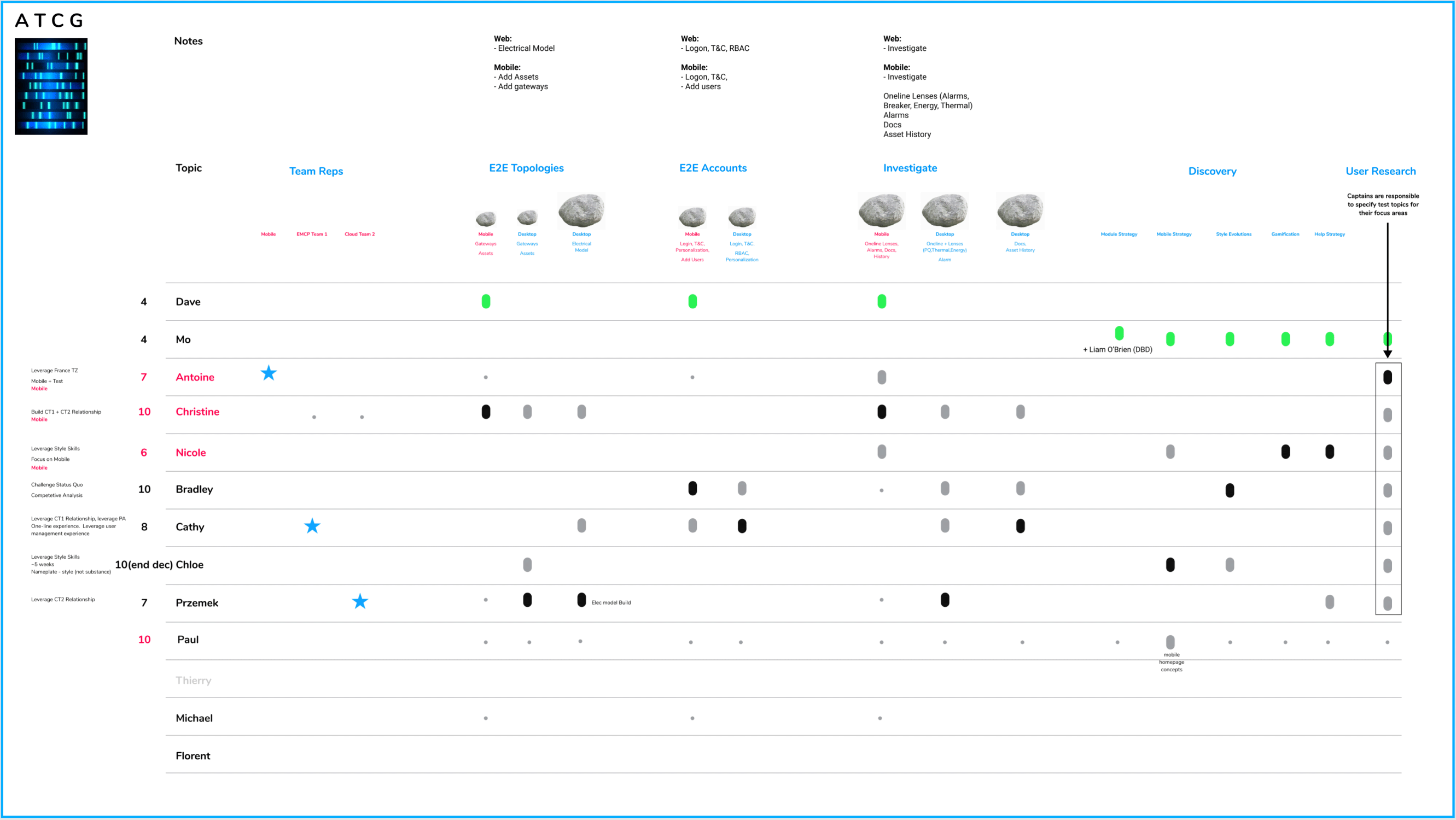
Twelve designers, one matrix
A management matrix aligned all 12 designers across 17 sub-tasks with intentional overlap, keeping design consistent and coverage continuous over a two-year roadmap.
An better UX starts with a better Information Architecture
Every Schneider Electric application shared one outdated information architecture. Mø proposed two competing next-generation alternatives, then merged the best of both into a new "goal-based architecture" built not around navingating UX objects, but about navigating to an intended action.

Research at scale
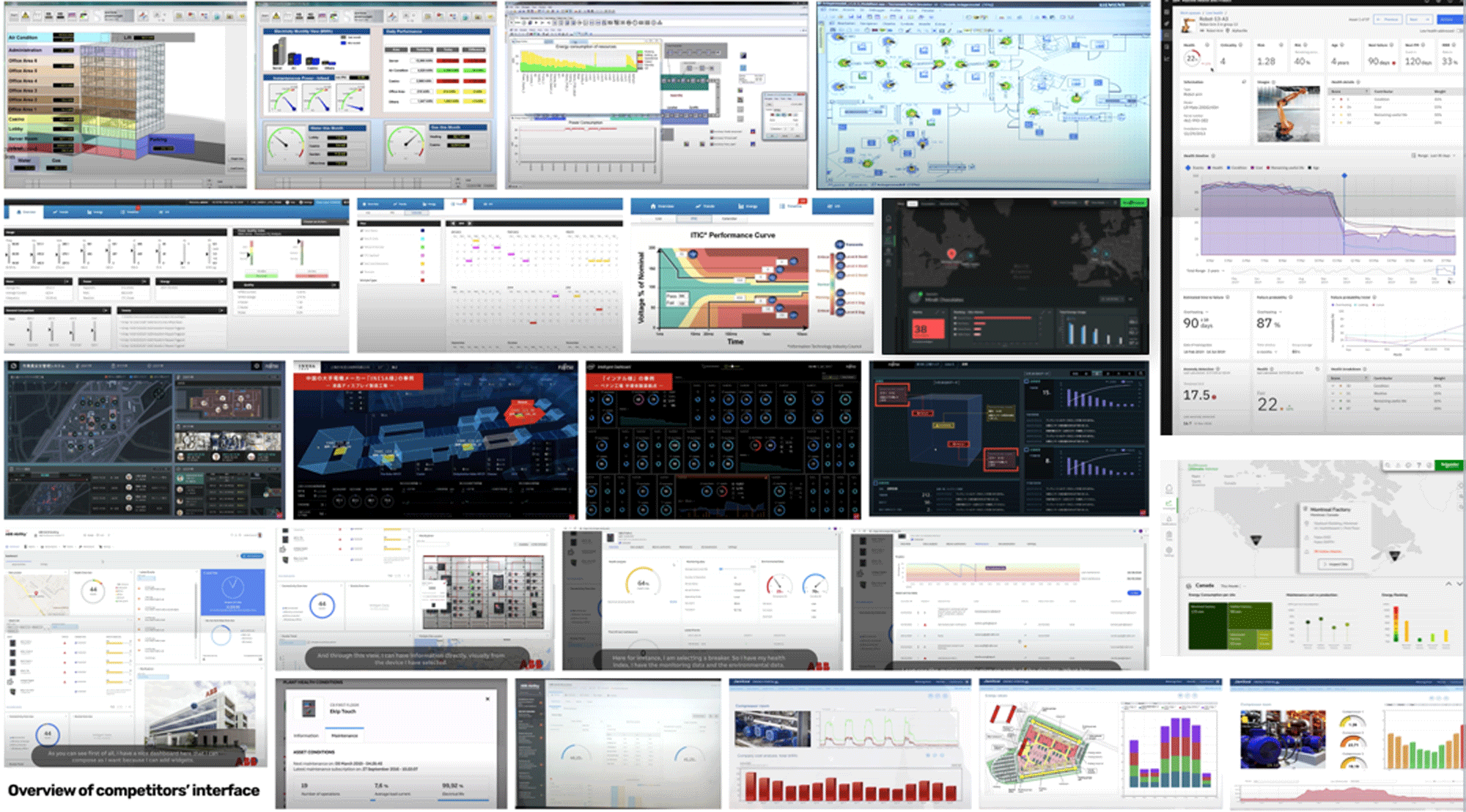
All 12 designers took part in the research effort: competitive analysis, ethnographic studies, task analysis, card sorting, user interviews, A/B testing, and field studies distilled into 100 insights that grounded every design decision that followed. Below is an artifact depicting our competitive analysis of comparable UIs and the grid of 100 key insights.

Killing a feature leadership loved, with data
Some leaders, inspired by Facebook and LinkedIn, pushed hard for a social-style news feed. Mø thought it was out of place in an operations dashboard, but designed it anyway and put it in front of users.


Testing found little support for the feed. That evidence justified killing it entirely, saving roughly $30,000 in development costs, and demonstrating the value of the research practice Mø had built.
Designing the four-panel system UI
Research showed operators needed system hierarchy, device location, technical diagrams, and live data all visible together, but interacted with separately, and arranged however suited their own workflow. The answer was four discrete, retractable panels built around a drag-and-drop "canvas."

Retractable panels
A lo-fi concept for four viewing panels users could retract and rearrange to fit their own preference.

The four-panel canvas
Taking the retractable panels concept and applying it to the research-driven UI requirements.

Mature dashboard design
The four-panel system at hi-fidelity: asset hierarchy, asset detail, data drawer, and canvas working together.

Late-stage UI design
As the design system matured, the UI evolved into a more sophisticated, refined visual language.
Making the asset hierarchy legible
Every site, from a single switchgear to a full factory floor, had to live in one configurable hierarchy: office space, electrical room, production floor, down to individual assets. Early wireframes and annotations worked through how that hierarchy should surface on both desktop and mobile including Drag & Drop functionality for ease assembling large systems.


Beyond the desktop: Tablet and mobile
Schneider's design system had no dark mode. Mø created one and directed all UI work to be done in dark mode as very intentional psychological reinforcement that this app was not simply an updated iteration of the legacy app, but reimagined from the ground up, a completely new generation. Mø extended that "Next Gen" concept with a dashboard builder feature allowing users to create their own dashboard layouts from a collection of widgets the user could assemble to suit bespoke workflows. Designing for tablet surfaced a bigger recommendation: move desktop's primary navigation from the top of the screen to the side.


DIY - User-definable dashboards
Mø extended that "Next Gen" concept with a dashboard builder feature allowing users to create their own dashboard layouts from a collection of widgets the user could assemble to suit bespoke workflows.


Validating with users, continuously
Design direction was tested early and often, not just once at the end. That discipline is what made it possible to defend decisions to leadership and to catch problems while they were still cheap to fix.
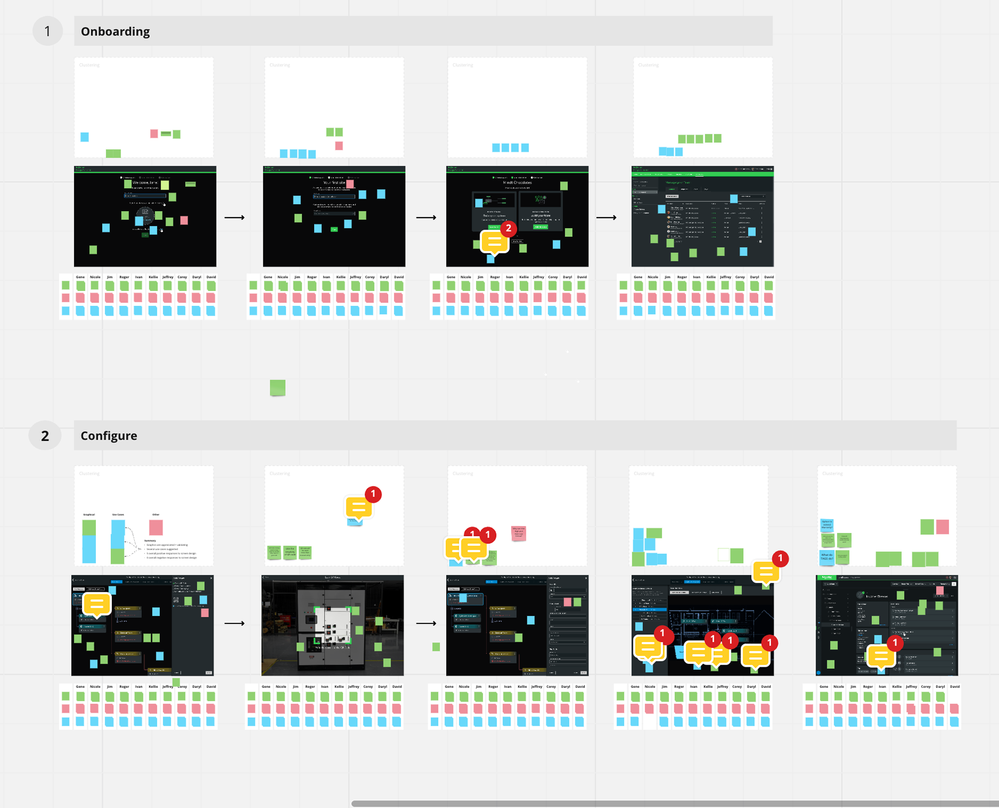
Continuous testing
Onboarding and configuration flows tested repeatedly to keep design trajectory honest.
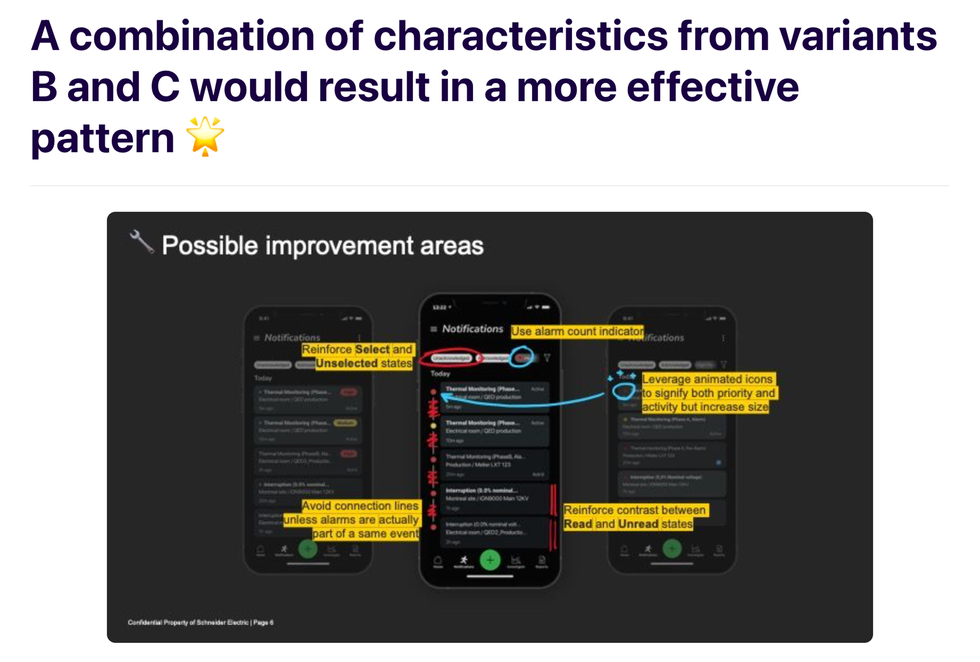
Mobile UI feedback
A deck distributed to the dev team explaining why each mobile design decision was made, and what still needed work.
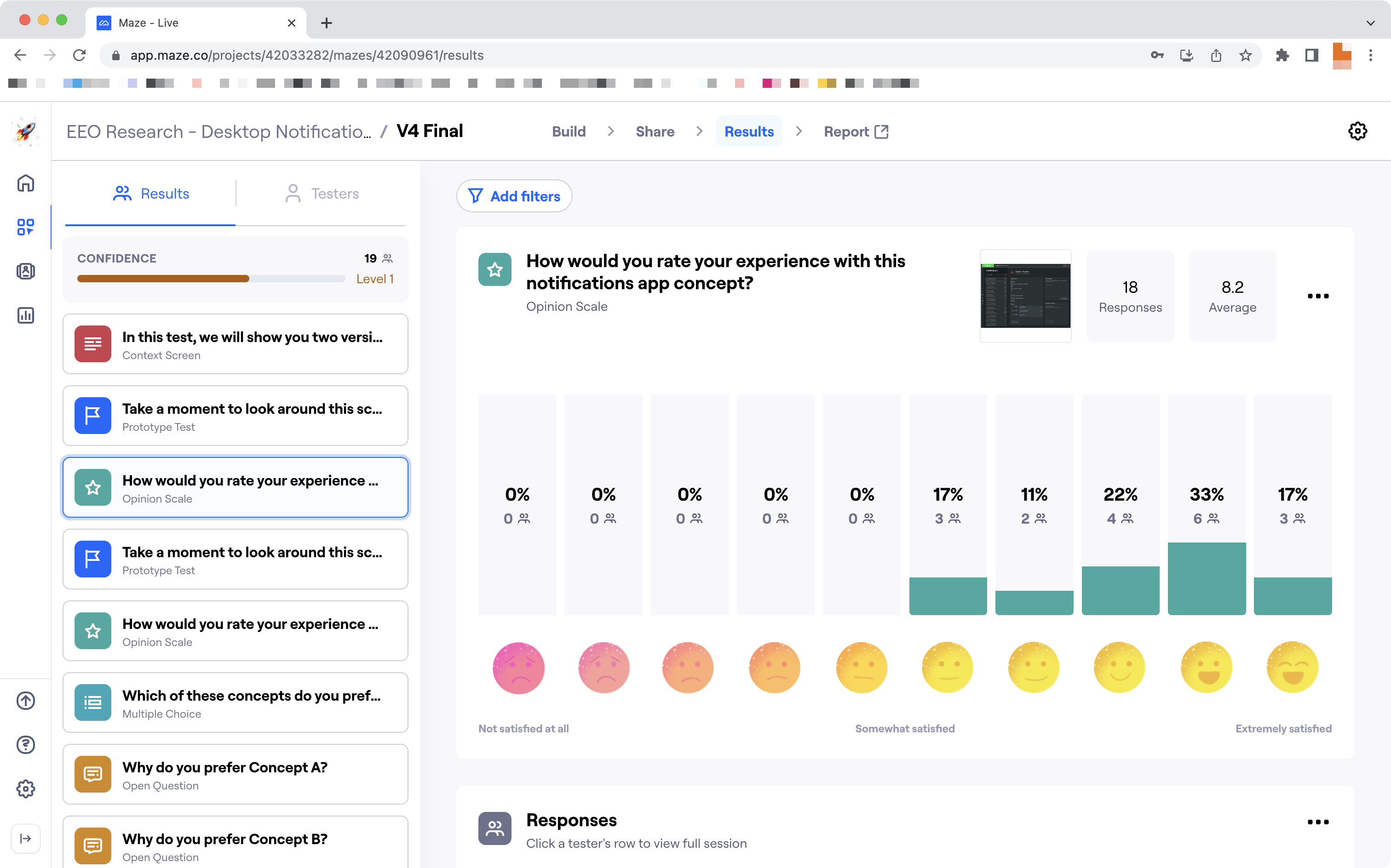
90% satisfaction
Using Maze as a testing platform, the notifications concept landed an 8.2 average rating and a peek at 90% satisfaction.

Who can see what, who can act
Multi-site industrial accounts meant complicated permission structures: admins, operators, and viewers scoped to specific factories. Team management went through several iterations to make roles and access legible instead of a wall of checkboxes.
The end-to-end workflow
Development began before the information architecture was fully established, the cart before the horse. As the project's complexity grew, competing opinions among domain leaders started to fracture the path forward. Mø built a comprehensive end-to-end workflow document mapping every screen, feature, and function giving engineering, product, and design one shared reference to build against. This document literally saved the project from a catastrophic derailment.
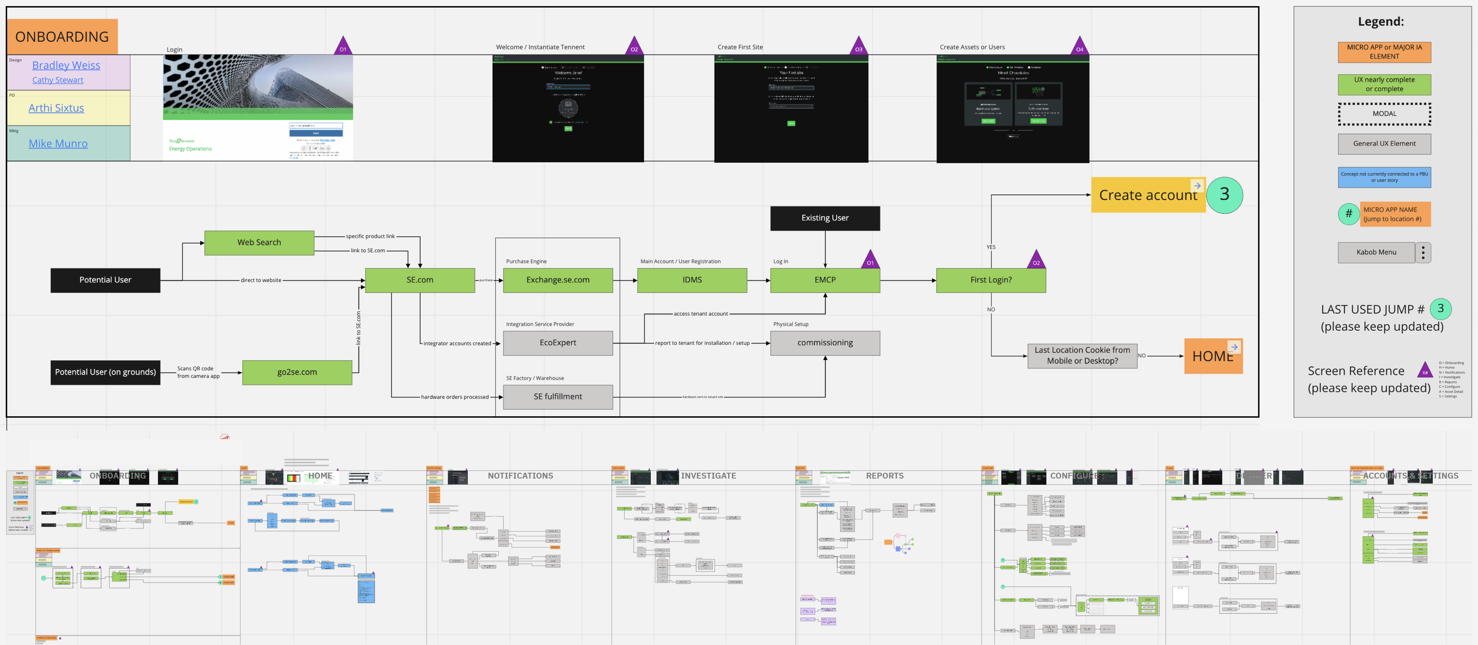
EcoStruxure Energy Hub, in the wild
The product shipped under its final name, Energy Hub. Mø is candid about the gap between this MVP and the more refined designs behind it: when a launch date is set years in advance and stays fixed regardless of what research uncovers along the way, UI engineering ends up lagging the UI design. It shipped anyway, and it worked.


An award-winning design system, carried forward
For the next iteration, an Art Director refined Mø's UI direction further. The result reflects the advanced state of the award-winning Schneider Electric Design System that grew out of his original designs for Energy One.
Related work at Schneider Electric

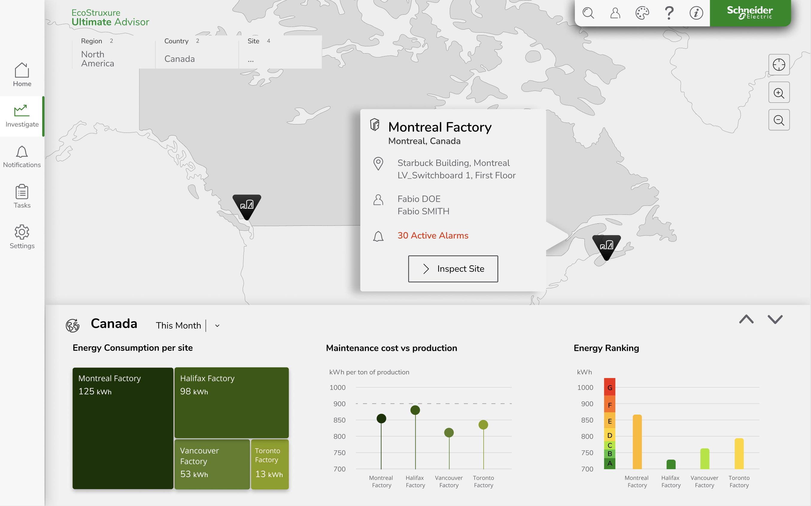
Advisory tooling for water treatment operators, built on the same practice.
Seamless
A unified plant domain and digital services layer for the same operators.

Collection of various designs serving multiple product groups and innovation initiatives. COMING SOON!
Get in touch
Let Mø know what you're working on and what you need from design leadership or product innovation.

